
Workday Redesign—
UX Research+Design
Prototype Demo
Role
UX Researcher and Designer
Duration
Mar 2025 - May 2025
Tools
Figma, FigJam, Google Sheets
Project Overview
Results
Context
In 2025, the job market continues to be highly competitive, and looking for a job has become a full-time job in itself. Job seekers often face a repetitive and inefficient application process, which can be overwhelming and frustrating. Workday, a widely-used recruitment platform, plays a key role in this experience, and by improving its design, we aimed to make the application process smoother, more intuitive, and less time-consuming for users.
Process
We followed two iterations of the design lifecycle.
Initial Needfinding
Heuristic Evaluation
✓
Visibility of system status
✓
Match between the system and the real world
✕
User control and freedom
✓
Consistency and standards
✕
Error prevention
✓
Recognition rather than recall
✕
Flexibility and efficiency of use
✓
Aesthetic and minimalist design
✓
Help users recognize, diagnose, and recover from errors
✕
Help and documentation
User Surveys
To better understand user frustrations and inefficiencies in the Workday job application process, we distributed a targeted survey to 11 individuals with prior experience using the platform.
The following themes highlight key areas for improvement:
Repetition
70% of users expressed frustration with entering the same information for multiple applications.
Time
80% found the process time-consuming; 60% said it took 10–20 minutes
per application.
Difficulty
60% rated the application experience as difficult, reinforcing the need for
UX improvements.
Bias Mitigation
Before conducting interviews, we carefully considered potential biases in our research and developed strategies to reduce their influence, ensuring our insights would be as accurate and representative as possible.
Self-selection bias:
Users with strong opinions may be more likely to respond. To address this, we distributed the survey across diverse job-seeking communities.
Recall bias:
Participants may forget details. To reduce memory inaccuracy, we limited questions to recent experiences (within the past 6 months).
Social desirability bias:
Respondents may give answers they think we want to hear. To encourage honesty, responses were anonymous and neutrally worded.
User Interviews
We conducted interviews with 5 individuals who had used Workday to apply for jobs, aiming to capture detailed, personal experiences and pain points. These participants represented a range of industries and levels of job-seeking experience.
The conversations revealed consistent pain points: users were frustrated with the repetitive and time-consuming nature of the application process, and had difficulty tracking their submissions. These findings helped us move beyond our personal assumptions and ensured our designs addressed real, validated user needs.
Initial Design Alternatives
To explore solutions for the issues uncovered in the needfinding phase, our team conducted a two-phase brainstorming process. We began with individual ideation and then held a group session to expand on these ideas.
From 15 initial concepts, we selected the following 3 design alternatives.
1. One-Click Apply
2. Profile Integration (LinkedIn/Indeed)
This idea streamlines the setup process by importing applicant data directly from LinkedIn or Indeed. It reduces manual input, improves data accuracy, and allows users to leverage their existing online professional profiles.
3. Central Application Hub
This feature provides users with a centralized space to track all applications submitted through Workday, across different companies. It enhances transparency and control by offering a consolidated view of application status, deadlines, and required next steps.
Initial Prototyping
Before developing our prototypes, we chose to skip low-fidelity sketches and move directly to medium-fidelity wireframes. We translated our brainstormed ideas directly into more functional, interactive layouts which allowed us to test more realistic user flows early on, enabling more meaningful user feedback while staying efficient with our time and resources.
We created three medium-fidelity prototypes using Figma. Each prototype addresses a key user frustration identified during the needfinding phase.
1. One-Click Apply
This prototype presents a simplified job application interface embedded alongside the job description. Clear prompts like “Interested in this job?” reduce cognitive load and encourage quick action.

One-Click Apply Prototype
2. Profile Integration (LinkedIn/Indeed)
This prototype allows users to import their LinkedIn or Indeed profiles directly into the application process. The import option is clearly visible at the top of the application screen, reducing the need to search or leave the page.

Profile Integration Prototype
3. Central Application Hub
This prototype introduces a dashboard for users to view and manage all applications submitted through Workday. The layout is designed for ease of navigation and to reduce user effort in managing applications.

Central Hub Prototype
Initial Evaluation
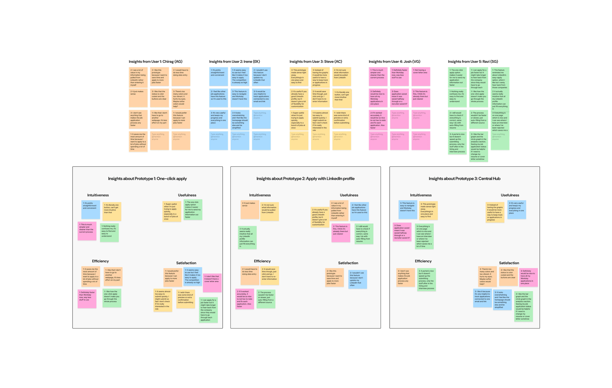
To evaluate our prototypes, we conducted a survey and short user interviews with individuals who had applied to jobs via Workday. Participants rated each design against the current Workday platform based on intuitiveness, efficiency, usefulness, and satisfaction using a 5-point scale. We analyzed results using one-sample t-tests against a neutral score of 3.
For interviews, we gathered both quantitative and qualitative feedback. Open-ended questions explored first impressions, clarity, and preferences, with responses grouped into themes using affinity mapping.
Quantitative Results
We conducted a survey with 14 participants and interviews with 5 users to evaluate three prototypes against the existing Workday system. One-sample t-tests were used to compare user perceptions across four metrics: intuitiveness, usefulness, efficiency, and satisfaction.
Results showed significant improvements for all prototypes, with One-Click Apply receiving the highest ratings in all categories (Intuitiveness: 4.16, Usefulness: 4.21, Efficiency: 4.37, Satisfaction: 4.47). LinkedIn Profile and Central Hub also showed strong performance but had slightly lower scores, particularly in efficiency.
Qualitative Insights
Interview responses were categorized into themes: intuitiveness, usefulness, efficiency, and satisfaction.
Key findings include:
One-Click Apply was praised for simplifying the process and saving time.
LinkedIn Profile received mixed feedback, with concerns about the need for profile updates, making it less appealing.
Central Hub was appreciated for tracking applications but was seen as less effective in speeding up the application process itself.
These insights indicate that combining features from One-Click Apply and Central Hub could significantly enhance user experience by both simplifying the application process and tracking progress more efficiently.
Qualitative Analysis in Figjam
Final Prototyping
One-Click Apply
Added an optional cover letter field to support customization without compromising speed.
Retained original layout and placement due to strong user approval of its clarity and ease of use.
Central Application Hub
Simplified visual design and color scheme in response to feedback about visual overload and distraction.
Removed the analytics graphs as users reported that they found them unnecessary and distracting.
Prototype Demo
Final Evaluation
Quantitative Results
All ratings were statistically significant (p < 0.05), indicating clear improvements over the existing system. Efficiency received the highest average score, validating the impact of features like One-Click Apply. Users consistently rated the prototype as easier to use, more effective, and more enjoyable than the current Workday interface.
Qualitative Insights
Think-aloud sessions and open-ended survey responses provided additional context. Users appreciated the Central Hub for its clarity in tracking application statuses, reducing the need for personal spreadsheets. The One-Click Apply feature was praised for minimizing repetitive input and streamlining the process.
Participants described the overall experience as less frustrating and more empowering. Many noted reduced stress and greater confidence when applying. A few users suggested further improvements, such as better filtering and more job customization options, indicating a desire for even more flexibility and control.