
Siemens Telemetry Tool—
UX Research
Role
User Experience Intern
Duration
May 2025 - Aug 2025
Tools
FigJam, Siemens Software Analytics Tool, Microsoft Excel, Powerpoint, Outlook, Teams
Project Overview
Results
Context
Teamcenter is a complex enterprise platform with a wide range of user types and workflows. While a telemetry tool existed to capture user behavior within the platform, it was underutilized by UX teams due to limited awareness, lack of tailored reports, and unclear data accessibility.
My role was to take the first step toward enabling data-driven UX decision-making by investigating the telemetry tool's capabilities, identifying how it could support UX research, and making it easier for UX designers to extract actionable insights.
Process
Note: Due to confidentiality, images shown in this case study have been intentionally blurred to protect internal information.
Phase 0: Understanding Telemetry
Before I could begin, I had to understand what telemetry actually was. In short, telemetry is the automatic collection of data about how users interact with a product, similar to how Google Analytics tracks activity on a website. For Teamcenter, this means capturing detailed usage patterns, feature interactions, and user flows.
Once I understood its purpose and potential for UX, I was able to create a structured project plan to explore the data and make it more useful for the design team.
Phase 1: Evaluate the Telemetry Tool
Usability Evaluation
To understand the telemetry tool’s capabilities, I conducted a full evaluation of all pages, reports, and available features. Each screen was documented through screenshots and compiled into a FigJam board, where I annotated the purpose of each report, defined key data terms, and flagged any unclear metrics.
This process resulted in a comprehensive visual reference of the tool’s structure and highlighted opportunities to improve data presentation for UX teams.

Few Screens from Usability Evaluation
Telemetry Inventory
After the evaluation, I created a comprehensive inventory of all available telemetry metrics. Using FigJam, I organized the data into categories, listing each metric with its description and the type of information it could provide.
This inventory provided a clear picture of the data’s scope and served as a reference point for later phases, helping me match UX research needs to available telemetry and identify potential data gaps.
Command Code Names & Error Codes
While reviewing the telemetry tool, I found that some reports referenced system command code names rather than the UI labels seen by users. To interpret these correctly, I cross-referenced the telemetry data with the Teamcenter UI to match code names to actual user actions.
In addition, several reports included error codes without context. I collaborated with the development team to define their meanings and clarify how they related to specific user behaviors. This work established a foundation for mapping raw telemetry data to user-facing actions, which was critical for making the insights meaningful to UX designers.

Phase 2: Identify Key UX Questions
The goal of this phase was to gather targeted UX research questions from the team to understand what decisions telemetry could inform, identify current pain points, and uncover gaps in available data.
Interview Guide
I created an interview guide focused on uncovering what telemetry insights would be most valuable for UX. The questions centered on current pain points, design decisions that could be informed by data, and any gaps in understanding user behavior.
Some questions included:
"What kinds of usability or user behavior questions are most important for your team to understand right now?"
"Telemetry gives us aggregate patterns like most common actions, frequently visited pages, session flows, or time spent on key views. With that in mind, what UX questions do you think can be answered to support your team? "
"If telemetry data pointed to a trend or common user behavior, would your team take any additional steps to confirm that the insight is accurate or worth acting on? If so, what might that look like?"
Interviews
I met with team leads from the 6 different product domain areas of Teamcenter to learn about their specific UX research needs.
These conversations also revealed a unique challenge; as experienced UX professionals, the team leads were naturally curious and wanted to explore the telemetry tool itself, which sometimes shifted the discussion from needs-gathering to tool exploration. I guided these conversations to balance their curiosity with the project’s objectives, ensuring we stayed focused on uncovering the most impactful UX questions.
The interviews resulted in 76 total questions from the team leads. The pie chart below shows the distribution of questions contributed by each team:

UX Question Prioritization
After gathering all questions, each team lead selected the ones that would have the highest impact on design decision-making for their area of the product. These priorities became the foundation for later data mapping.
Phase 3: Map UX Questions to Available Data
Telemetry-UX Matrix Spreadsheet
I created a master spreadsheet mapping 70+ UX questions gathered during Phase 2 interviews to the telemetry metrics that could help answer it. This mapping allowed us to see not only where data could provide clear answers, but also where limitations existed.
To evaluate feasibility, I placed each question into one of three categories:
Category 1
We can derive meaningful insights using the available telemetry data.
Category 2
We can uncover some patterns, but insights are incomplete.
Category 3
The available telemetry data does not offer visibility into this area.
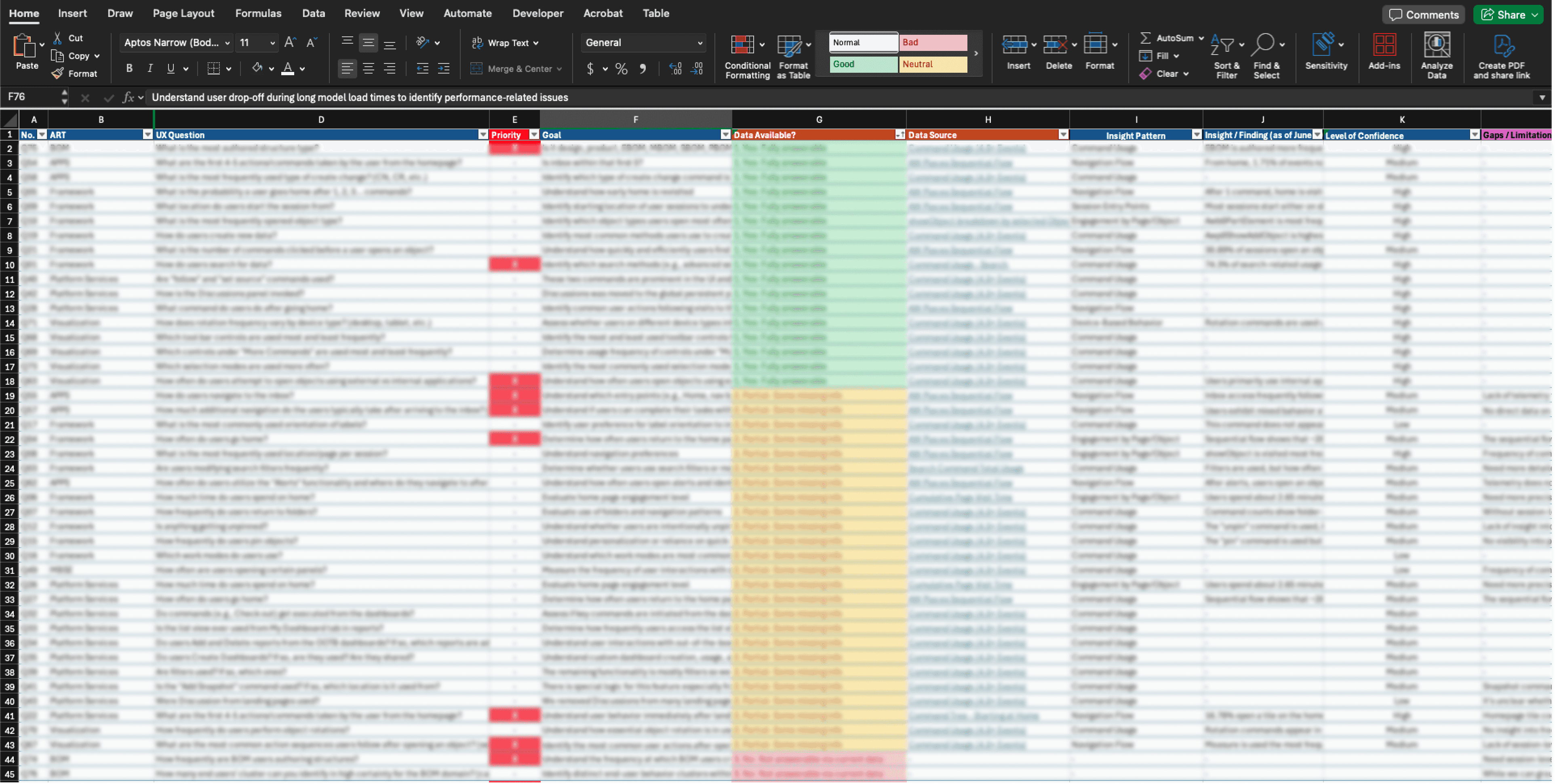
Matrix Spreadsheet
This mapping process provided a clear view of how the telemetry tool could directly support UX research and decision-making, and where future improvements in data collection were needed.
Phase 4: Validate Insights With UX Team Leads
Once the UX questions were mapped to available telemetry metrics, I shared the findings with each team lead to confirm whether the data truly addressed their priorities. During these sessions, we reviewed example metrics, discussed how they could (or could not) answer the original questions, and clarified any gaps in interpretation.
This phase served two purposes:
Validation: Ensuring the mapped data aligned with the intent behind each UX question.
Refinement: Identifying where additional data or different metrics would be necessary to make the telemetry tool more valuable for design decisions.
By the end of this phase, we had a refined set of telemetry-supported insights and a clear list of data gaps to address in future tool improvements.
Phase 5: Conclusions & Recommendations
The final phase was about providing actionable improvements to make telemetry more useful for UX design and product decision-making.
Analytics Team Requests
My recommendations included a prioritized list of requests for the analytics team to capture missing telemetry events, generate additional report types, and create a cross-product data tracking tool.
Custom UX-Focused Dashboard
I built a new UX-focused board within the telemetry tool containing filtered reports tailored to high-priority UX questions.
To surface more relevant data for UX teams, I added filters to the reports, such as targeting specific command IDs and excluding unrelated ones. This reduced noise in the reports and allowed designers to focus only on user actions relevant to their workflows.
Types of logic filters applied:
Preventing Data Misinterpretation
One potential risk was that a designer might not realize how a report had been filtered and unintentionally draw incorrect insights.
To prevent this, I added clear notes to each report outlining the filter logic and any excluded data, ensuring transparency and reducing the risk of misinterpretation.

This phase marked the transition from exploration to enablement, ensuring that the next time UX designers approach the telemetry tool, they can access relevant, clearly presented data without the steep learning curve I initially faced.

Me presenting to the UX team!