Natural Disaster Relief App—UX/UI Concept
Role
UX/UI Designer
Duration
Aug 2024
Tools
Figma, FigJam, Canva
Project Overview
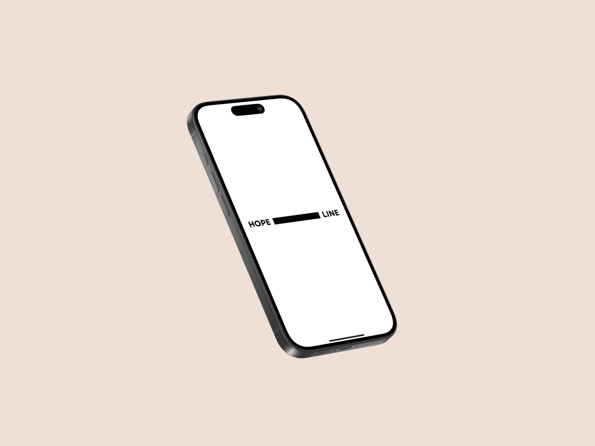
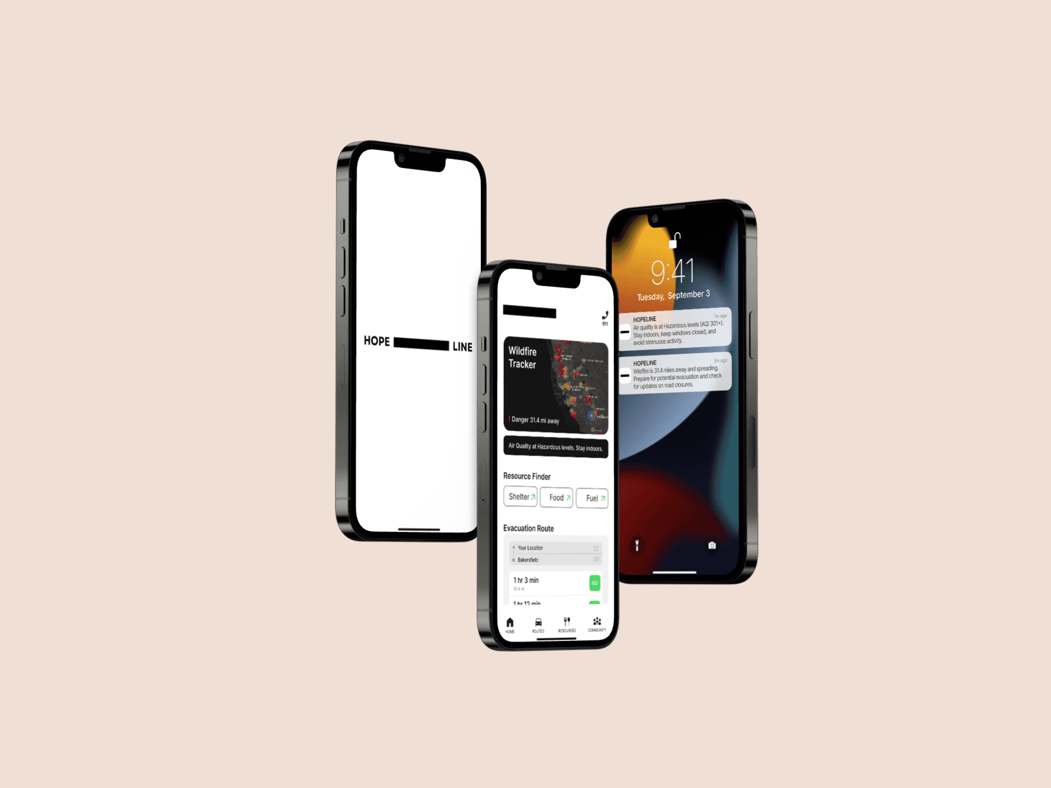
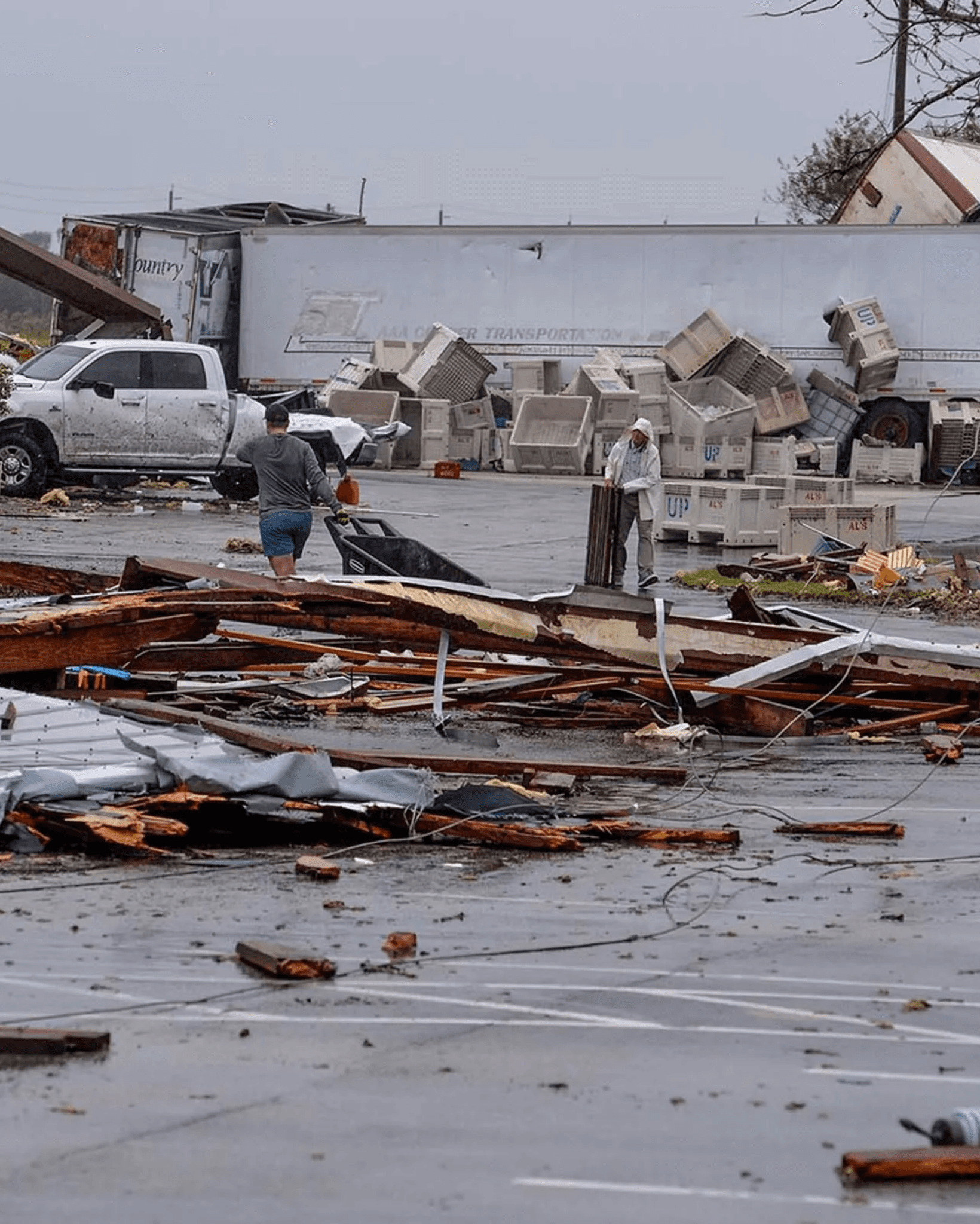
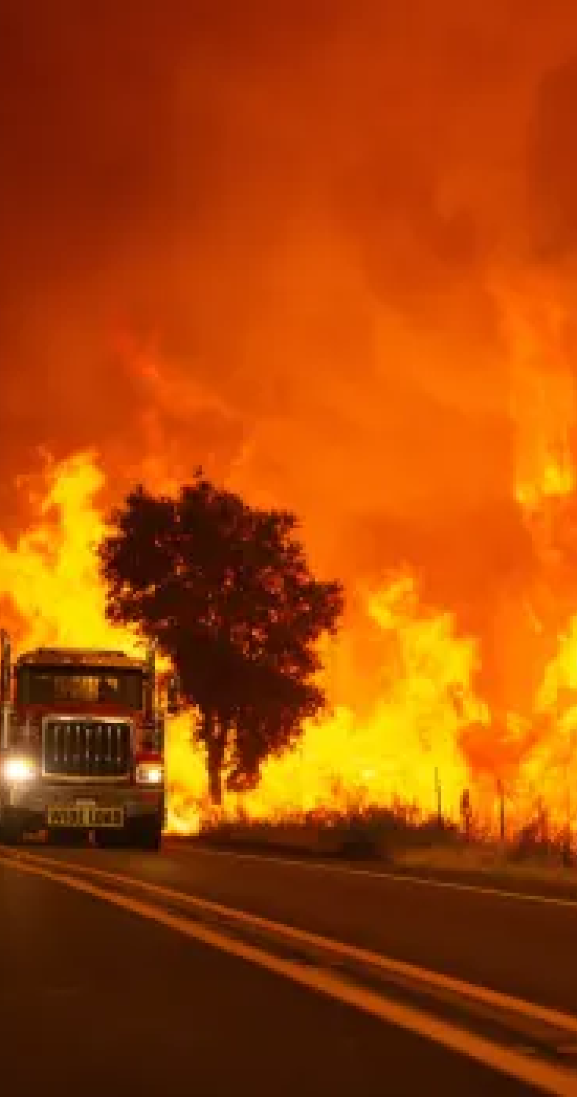
HOPELINE is a conceptual disaster relief app designed to help people make informed decisions during natural disasters. As part of the Google UX Design Certificate, I focused on creating an intuitive, user-centered platform that provides real-time updates on nearby shelters, disaster zones, fuel availability, and essential resources to help people stay safe.
Results
The app design ensures that everything users need— disaster proximity, nearby shelters, food, fuel, and evacuation routes—is easily accessible from the home page.
The design leads to an 83% decrease in clicks by automatically displaying the safest evacuation route on the home page, compared to the standard user path, which involves manually searching for routes.
With a clear, intuitive layout and real-time notifications, users can quickly find critical resources without unnecessary navigation.
Context
Process
Empathize
Secondary Research
Design Considerations
01
Offline Accessibility
In a real-world application, it would be essential for critical features to be preloaded before connectivity is lost.
02
Cognitive Load
The design has to balance providing detailed information while avoiding overwhelming users.
03
Limited Battery Life
The design must be lightweight, to ensure the app will run smoothly, even on low battery.
Define
User Personas

Sarah
32-year-old single mom with a 5-year-old child
Limited evacuation options due to financial constraints
She needs a safe, nearby shelter

Mark
50-year-old man with his wife and two dogs
Blocked roads, fuel shortages, unsure of the best route
He needs to find a safe evacuation route

George
74-year-old man living alone
Unable to evacuate due to limited mobility
He needs to stay safe and connect with emergency services if necessary
Key Features
1. Finding Shelters
Locating nearby shelters and checking for availability.
2. Route Safety
Receiving real-time updates on blocked or hazardous roads.
3. Essential Resources
Finding fuel stations, grocery stores, and medical facilities.
Information Archtitecture
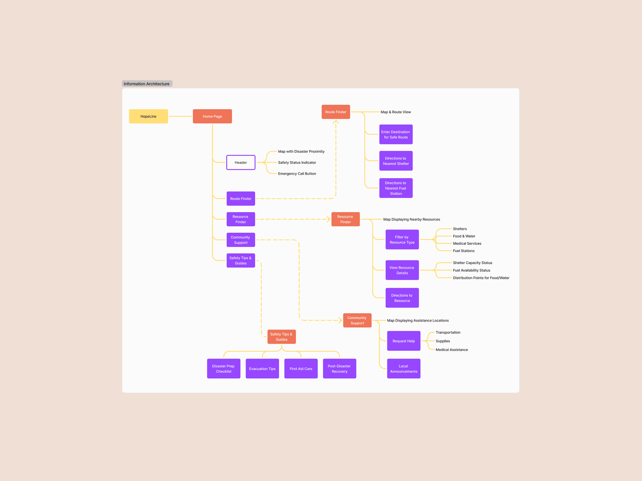
Information Architecture
Ideate
Prototype
Wireframes
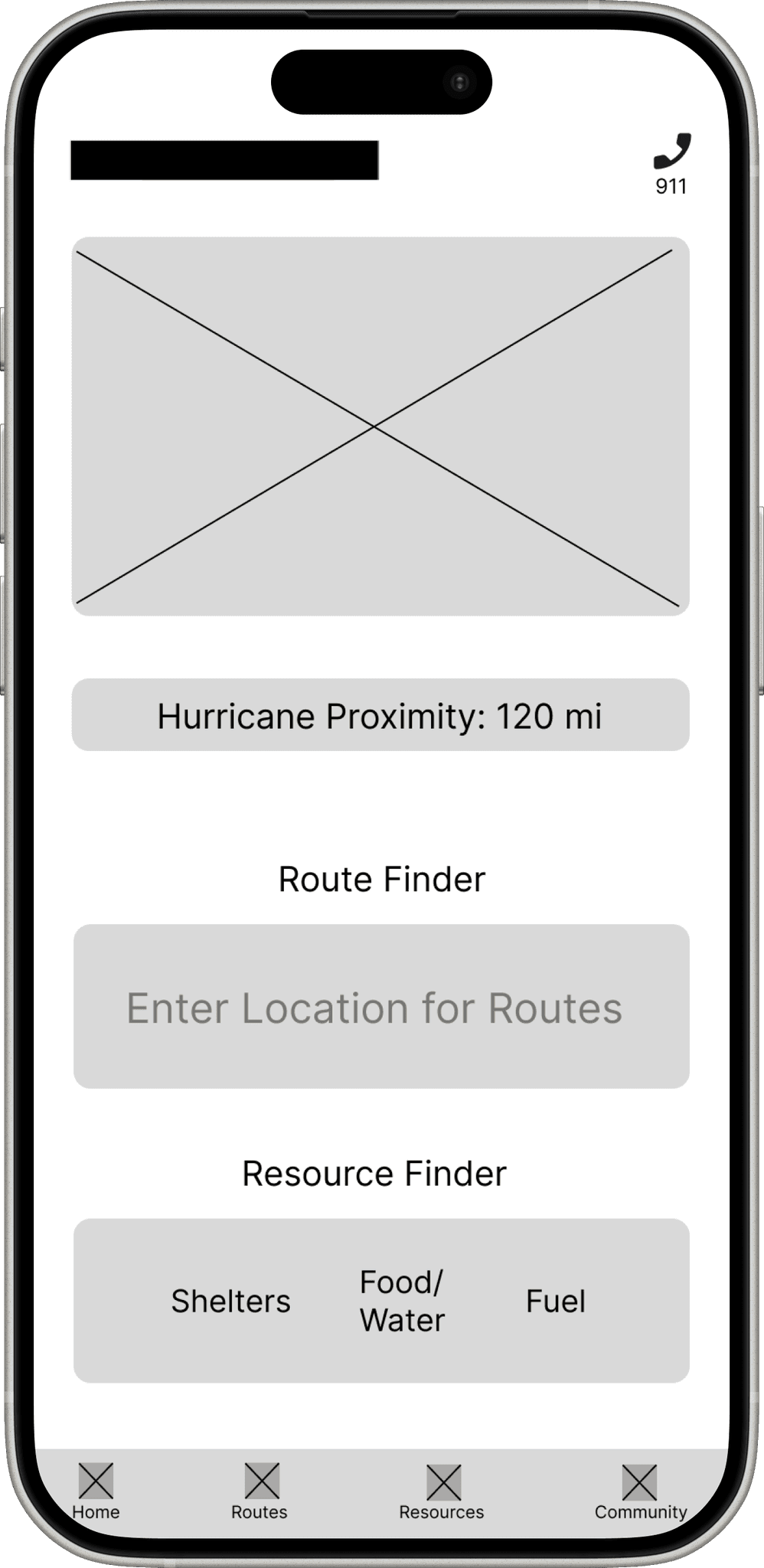
Wireframe
Prototype
Prototype
Test
Conclusion
The design of the HOPELINE app focuses on simplicity, providing clear access to critical resources like shelters, route safety, and essential supplies. Throughout the process, I realized that during natural disasters, many constraints can occur—such as limited internet access or low battery—so it’s essential to design with these in mind.
Following the design process from the Google UX Design Certificate helped me gain a deeper understanding of the user. Instead of jumping straight to solutions, I focused on first empathizing with the users' challenges and design based on their real needs and context, ensuring the app would truly help in a crisis.